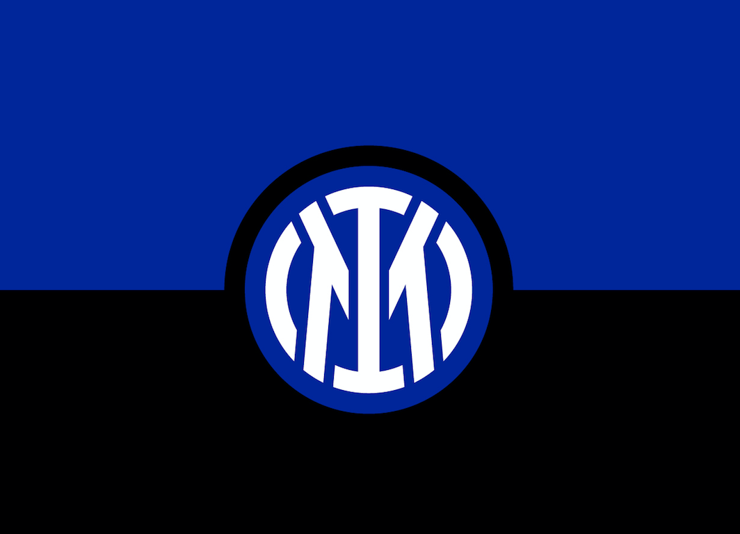
March 30 – Italian giants Inter Milan has unveiled a new logo and visual identity for club that will be used on playing shirts and rolled out across the club from the start of the 2021/22 season.
The club said the “new visual identity extols the club’s founding values and renews its bond with the city of Milan”.
The new logo plays on the clubs initials I M, from Internazionale and Milano, and the contemporary English language expression ‘I am’.
The objective of the revamp of the club’s visual identity is to open up the club brand to a wider digital audience “to reach global targets and different age groups, and establish itself as an icon of culture as well as sport. The aim is to make the Inter brand relevant and recognisable beyond its fanbase and to allow a younger and international audience to identify with the values of inclusion, style and innovation that have characterised Inter since its foundation,” said the club.
The modernised logo is a more streamlined and minimalist version of the traditional logo – designed to keep a connection with the club’s history. “While maintaining continuity with the original version, the new symbol is a more suitable fit for the age of entertainment,” said the club.

With the colours unchanged, the focus is in the letter I and M and remain framed in the classic concentric circles. The letters F and C, prominent in the old logo but not in the new, remain in the name and identity of the club – FC Internazionale Milano.
Originally designed by Giorgio Muggiani in 1908, the Inter logo has been no stranger to strange and design tweaks. It is now in its 14th iteration.
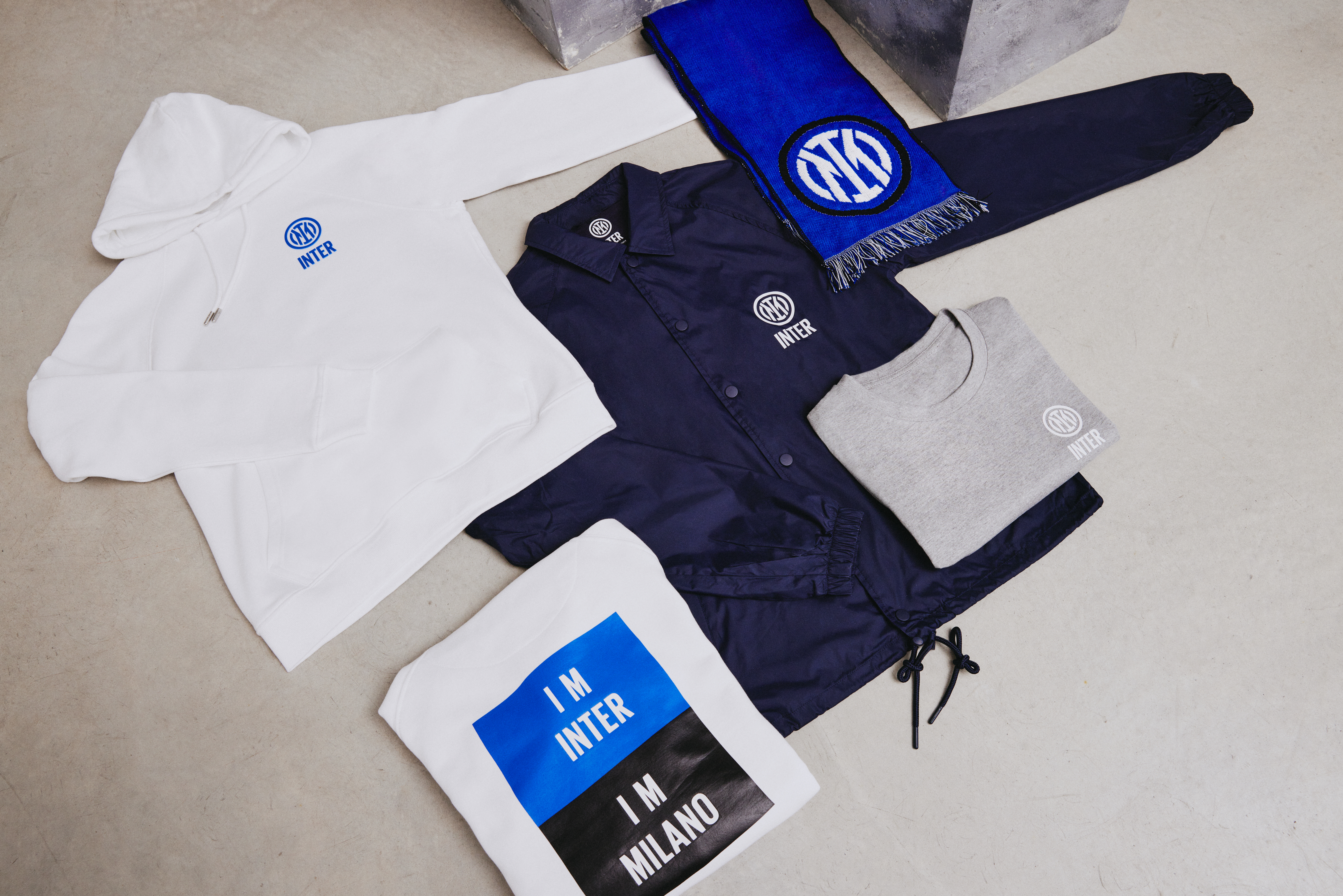
While the new logo will not appear on club shirts until the start of next season, it is already available on some merchandise available in the club shop.
Contact the writer of this story at moc.l1751422855labto1751422855ofdlr1751422855owedi1751422855sni@n1751422855osloh1751422855cin.l1751422855uap1751422855