September 28 – Major League Soccer’s Seattle Sounders have released the first images of the club’s new logo – the first branding change to the west coast side since 2008.
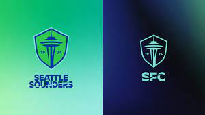
The reinvented club badge opts for a subtle, less-is-more approach, depicting the world-famous Seattle Space Needle flanked by the numbers 19 and 74, which form the club’s founding year when put together.
The Sounders’ front office sought input on the new branding from a diverse range of individuals, including fans, community members, and stakeholders. Additionally, they received feedback from over 10,000 completed surveys, as reported in a news release.
The club have settled on a simplified design with only the tower and foundation date on display.
The year takes prominence over the Seattle Sounders title banner, which has been dropped completely, as a reference to the club’s 50th anniversary next year.
“Today marks the culmination of much careful, contemplative and thorough work and it is incredibly rewarding to now introduce Sounders FC’s brand evolution,” club majority owner Adrian Hanauer said.
“It was a dream achieved to bring the Sounders to Major League Soccer in 2009, but, like many of our fans, my love for the club started long before its MLS era. As Sounders, our past runs deep and proud and that’s why we’re especially pleased to introduce this new visual identity, which isn’t so much a change as it is an evolution that more faithfully encompasses the entirety of the club.”
Seattle Sounders currently sit in 3rd place in the Western Conference of the MLS with four matches left to play.
Contact the writer of this story, Harry Ewing, at [email protected]